Recognize UX Audit
An independent audit of an employee-engagement platform: where the experience loses people, and a phased plan to win them back.
A solid foundation, with room to grow.
Recognize is employee-engagement and recognition software for HR teams. I ran an independent, fixed-scope audit of its website and platform covering usability, design and content.
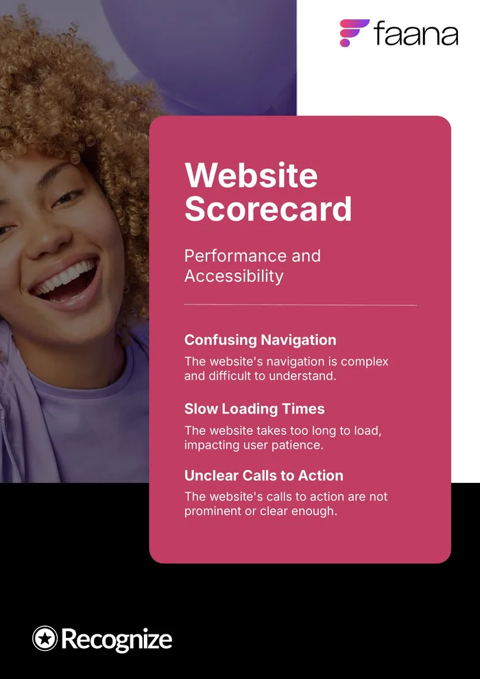
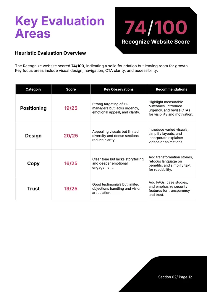
The site scored 74/100: a solid foundation, held back by confusing navigation, slow load times and calls to action that weren’t prominent or clear enough.
Five audits, one prioritized list.
Heuristic evaluation
Reviewed against Nielsen’s 10 usability heuristics and scored on Positioning, Design, Copy and Trust.
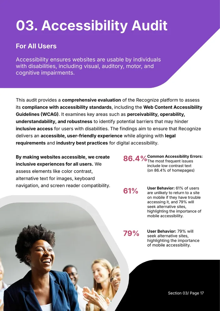
Accessibility
Checked against WCAG: touch targets, color contrast, accessible names, plus 10 manual checks like focus order and ARIA roles.
Performance and SEO
Page speed, image formats, backlink hygiene, structured data and social presence.
Reviews and personas
Patterns from Capterra, G2 and GetApp reviews, mapped against HR personas.
- 01Visibility of system status
- 02Match between system and the real world
- 03User control and freedom
- 04Consistency and standards
- 05Error prevention
- 06Recognition rather than recall
- 07Flexibility and efficiency of use
- 08Aesthetic and minimalist design
- 09Help users recognize, diagnose and recover from errors
- 10Help and documentation
Clear product, quiet story.
Strong testimonials and partner logos earned trust, and the screenshots showed the product well. But the copy leaned on features over benefits, CTAs lacked urgency, and dense sections overwhelmed first-time visitors.
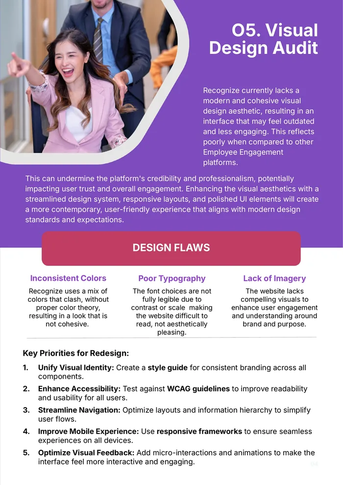
Visually, clashing colors, hard-to-read type and a lack of imagery made the site feel dated next to other engagement platforms. I proposed a WCAG-compliant accent palette, deepening the yellow from #FFEC03 to #F4AA04 with #1A1A1A text for high-contrast CTAs.
Positioning · 19/25
Targets HR personas and integrations well, but assumes prior knowledge and buries the value proposition.
Design · 20/25
Consistent, cohesive visuals; needs stronger contrast, less density and more diverse imagery.
Copy · 16/25
Unique and clean, but light on storytelling and emotional benefit.
Trust · 19/25
Testimonials score 5/5; the ‘why’ and objection handling score 3/5.
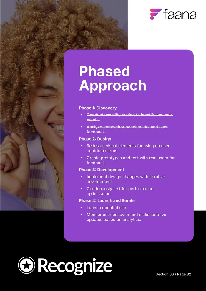
Four phases from findings to launch.
Discovery
Usability testing on key pain points, competitor benchmarks and user feedback.
Design
User-centric visual redesign, prototypes tested with real users.
Development
Iterative implementation with continuous performance testing.
Launch and iterate
Ship, watch the analytics, keep improving.
Extras went further: a Figma prototype of the current state and three proposed wireframes, a landing-page audit (66/100), a custom badge-builder recommendation to ease onboarding, and an in-app tooltip strategy.
A report the team could act on the next day.
The audit gave stakeholders a prioritized, phased redesign roadmap, plus the remediation lists, checklists and page-speed reports behind every recommendation.