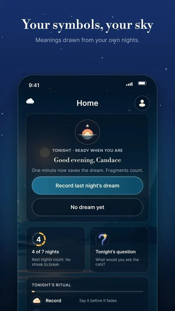
01 · Capture
Log it before it fades
Voice-to-text or typed entries, with fragments welcome. One tap from a dark, low-glare screen.
Designing an AI dream journal that turns half-remembered fragments into calm, personal reflection.
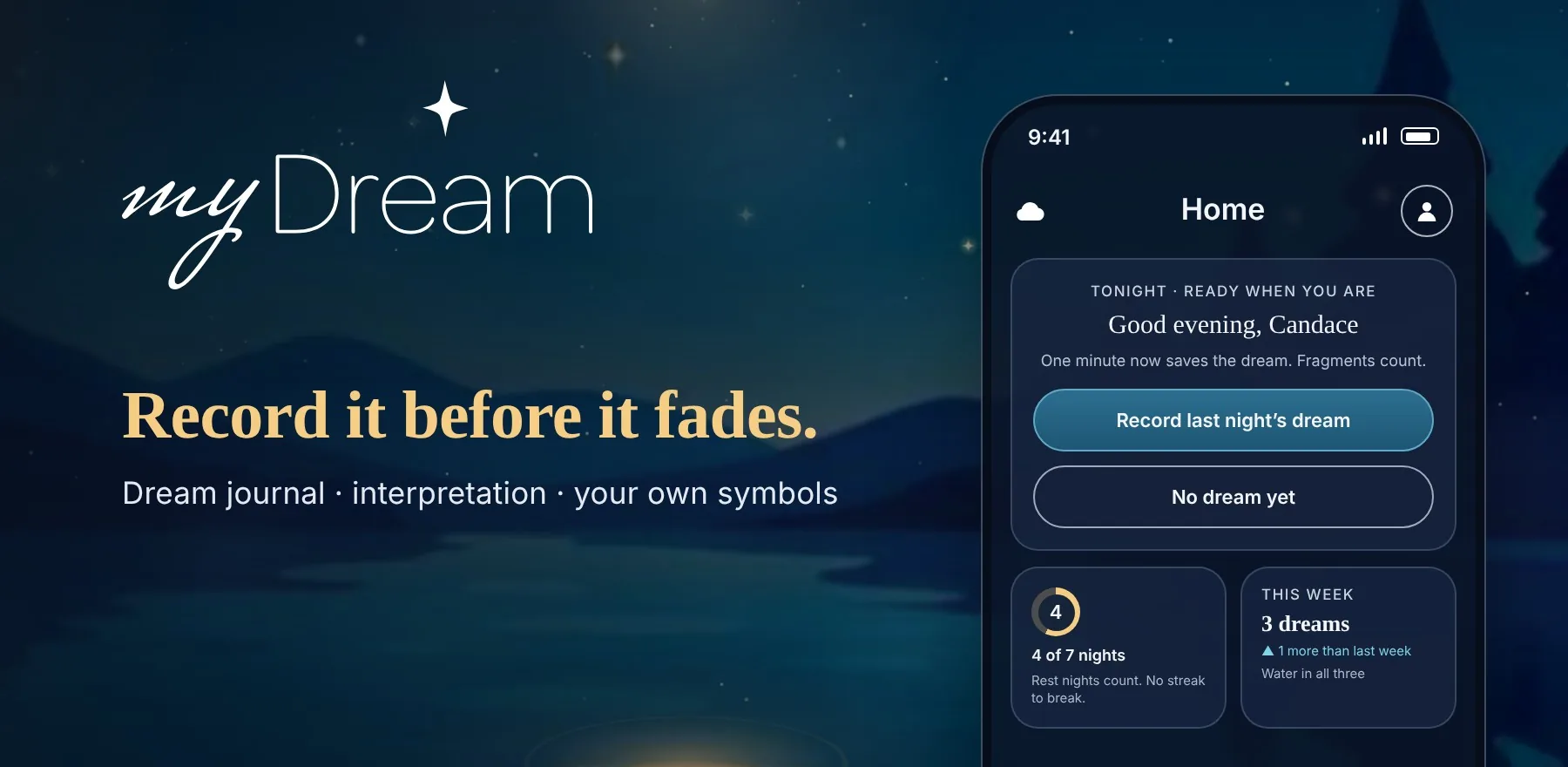
People wake up holding a few vivid fragments, and they’re gone before breakfast. Most journaling apps ask for too much, too early, and AI interpretation can feel cold or clinical.
myDream needed to make capture effortless at the groggiest moment of the day, then return something that feels thoughtful and personal, positioned as reflection and curiosity rather than diagnosis.
Gradients, including the gold and purple accents, are core to the brand. Every new or edited gradient is checked against WCAG contrast before it ships.
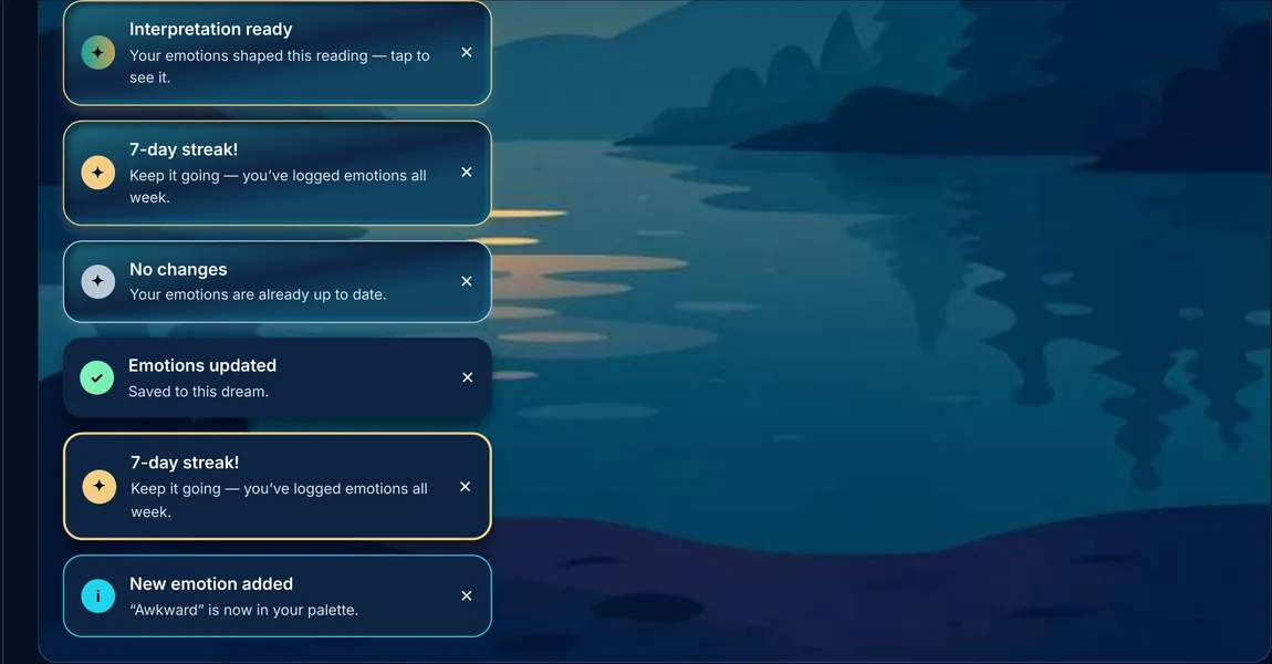
Low-contrast blue and teal notifications were replaced with high-contrast colors, placed higher on screen so they’re seen.
Glow and blur effects render differently on each platform, so we favor treatments, like solid strokes, that look right on both.
The moon motif sets the mood, but copy stays warm and encouraging rather than sleepy, with microcopy and imagery kept in tune.
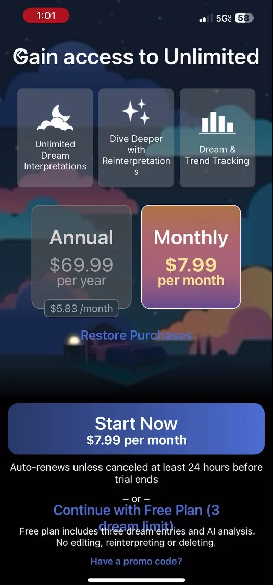
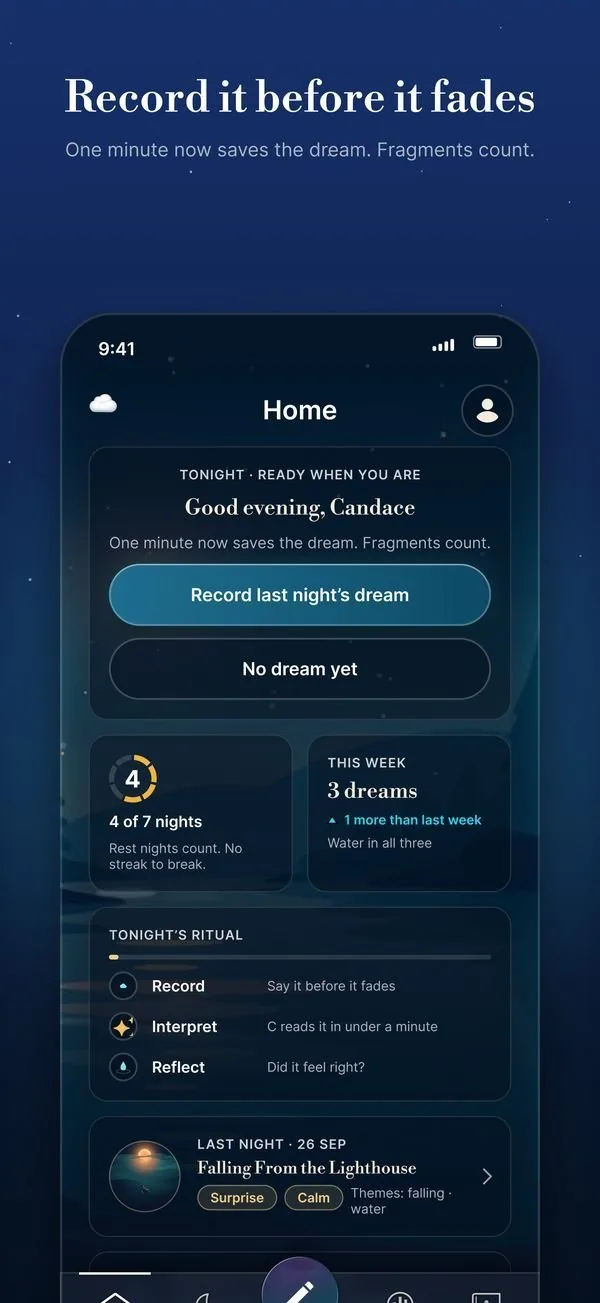
With my team, I ran six UX audits across onboarding, Home, the Dream Wizard and Trends, then folded every finding into one backlog and a phased plan. The goal was a consistency and quality pass on the brand’s night-sky look, not a rebrand.
The overhaul runs on a rebuilt foundation: tokenized color, type and spacing, new brand and mobile component libraries, and WCAG 2.1 AA checks built into the definition of done.
Tokens, component libraries and one contrast standard, so fixes land once instead of screen by screen.
Freemium onboarding restructure, paywall after the first interpretation and a quieter first Home visit.
One signup screen, one modal standard, one drill-in pattern for Trends.
Clear type hierarchy, gradient-less inputs, pill selectors and accessible word clouds.
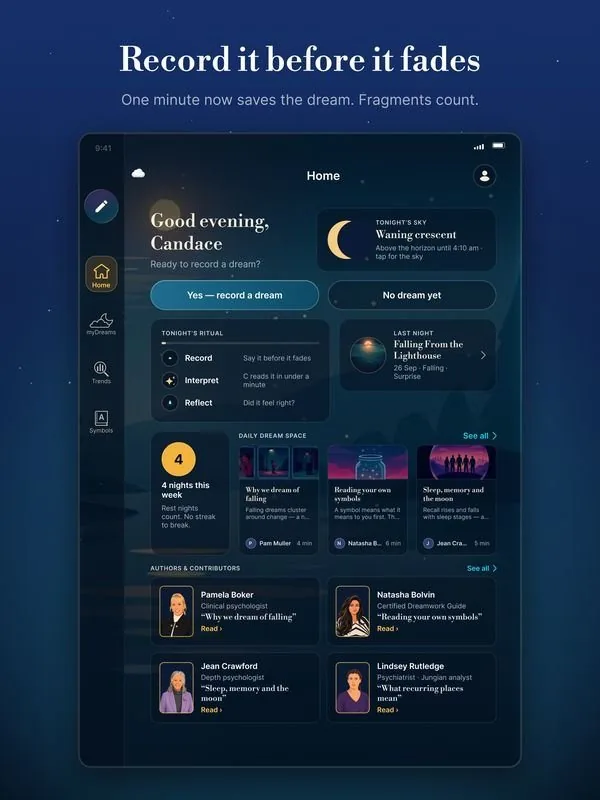
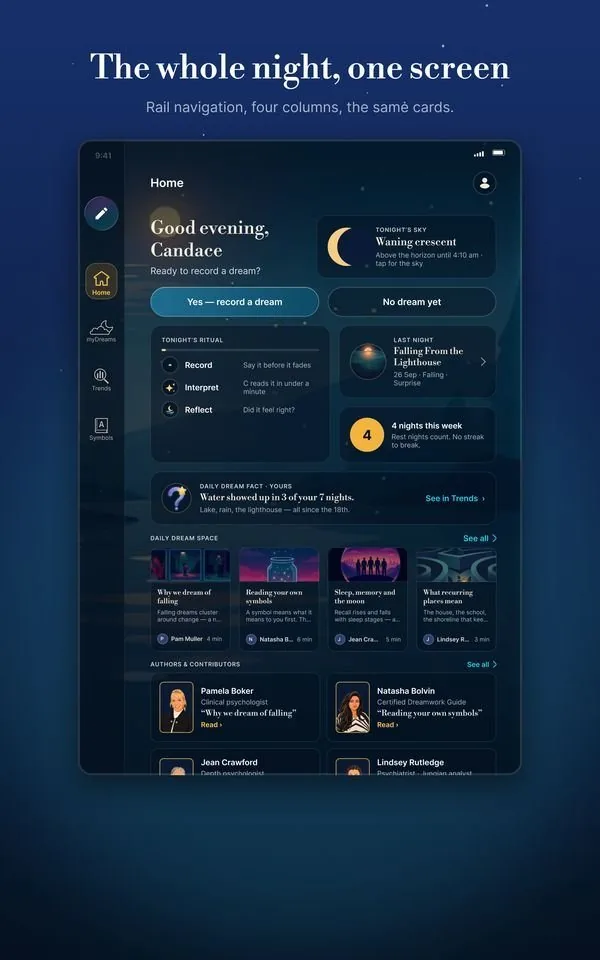
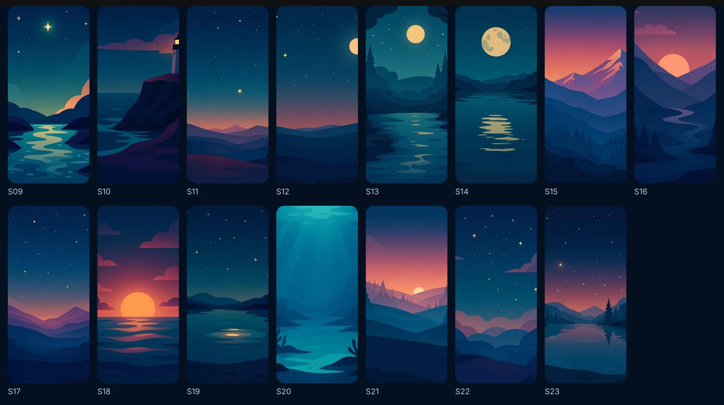
The new UI runs on one library, built in Figma as the Foundry and handed to the React Native app as tokens: glass surfaces floating over illustrated night scenes, one typeface and a teal, cyan and gold palette.
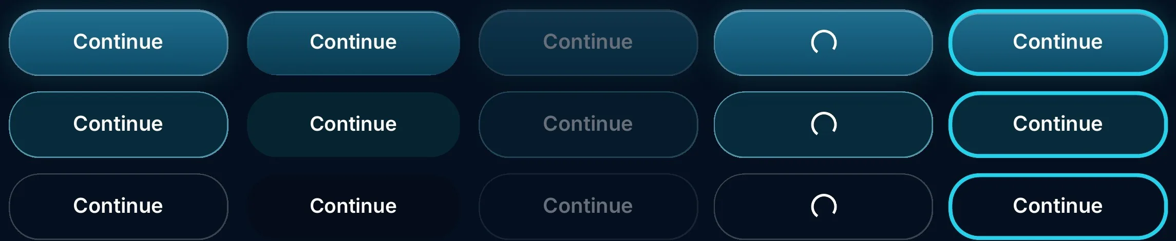
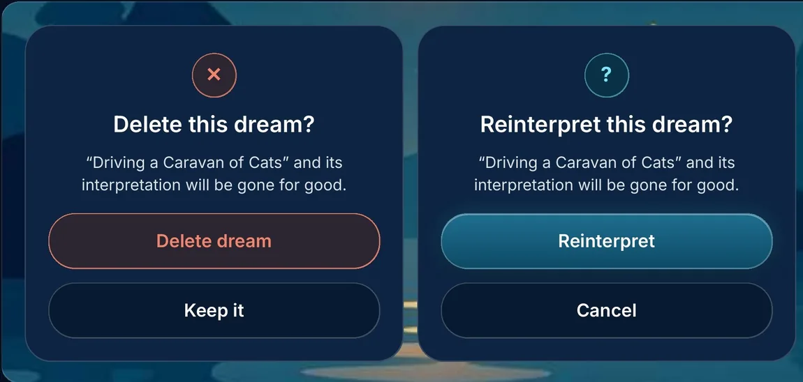
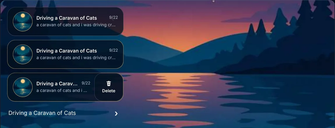
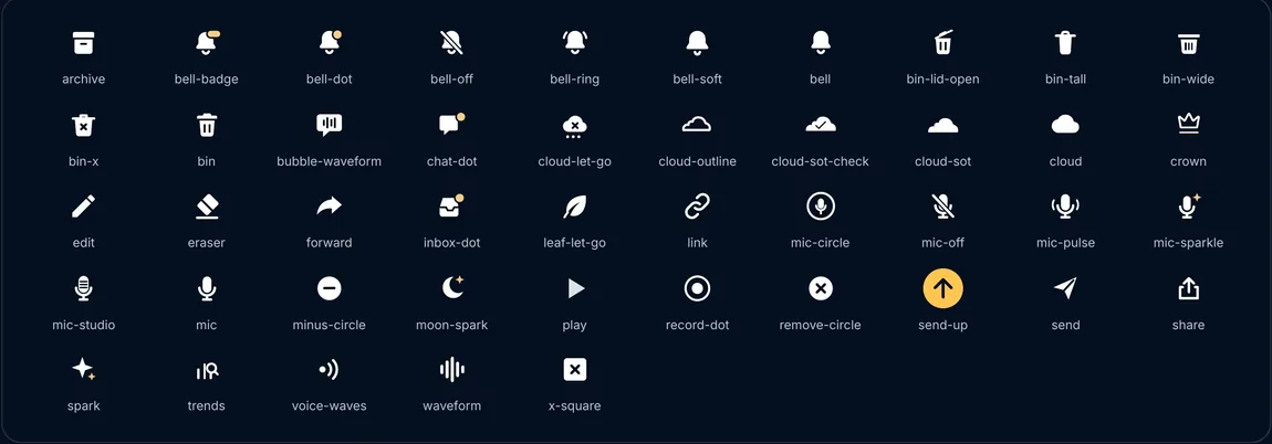
Every component is documented with its states, from buttons and dialogs to toasts, list rows and the icon set, so design and engineering build the same thing.
Reviewers call out the thoughtful interpretations, the calming design and the pattern tracking that turns single dreams into a bigger picture.